AI-powered dashboards for ci
Optimizing CI Troubleshooting Efficiency with AI Dashboards

This project focuses on redesigning CloudBees CI dashboards to improve data visibility, introduce AI-powered insights, and enhance developer workflows.
By integrating natural language queries and customizable widgets, the redesign enables developers to identify issues faster, troubleshoot CI/CD pipelines more effectively, and make data-informed decisions with ease.
Timeline
From 2024 to 2025, this initiative involved iterative improvements within a broader product revamp, running in parallel with other product enhancements and produt updates.
Background
CloudBees offers an enterprise-level continuous integration (CI) solution designed for software delivery teams. While powerful, the existing dashboards required developers to manually dig through logs and data to diagnose pipeline failures; an inefficient process that delayed troubleshooting and reduced developer productivity.
The aim was to transform the dashboard into a proactive decision-making tool, offering fast access to insights and tailored views of CI data.
Problem
Developers struggled with:
Limited data visibility, making it hard to locate pipeline issues quickly
Manual troubleshooting across multiple views and logs
Static dashboards that lacked flexibility or intelligent guidance
This led to longer debugging cycles, context switching, and overall decreased development velocity.

This category details the step-by-step approach taken during the project, including research, planning, design, development, testing, and optimization phases.
Research & Planning
The foundational user research was completed prior to this phase, involving interviews and surveys with real users, including both internal stakeholders and external developers. This comprehensive research provided deep insights into pain points and user needs, which directly shaped the redesign objectives.
Design & Prototyping
Built on these insights to create interactive, modular widgets and AI-powered dashboard components in Figma. Prototypes were iterated through internal reviews and early user feedback to ensure relevance and usability.
Implementation
Worked closely with engineering teams to develop the redesigned dashboards, integrating AI-driven query features and ensuring seamless interaction and performance.
Testing & Optimization
Conducted usability testing with developer users to validate design decisions and continuously optimize the dashboard experience based on real user feedback.
The redesigned AI-powered CI dashboard delivers an intuitive, interactive experience that empowers developers to quickly uncover pipeline issues and gain actionable insights; streamlining troubleshooting and accelerating software delivery.
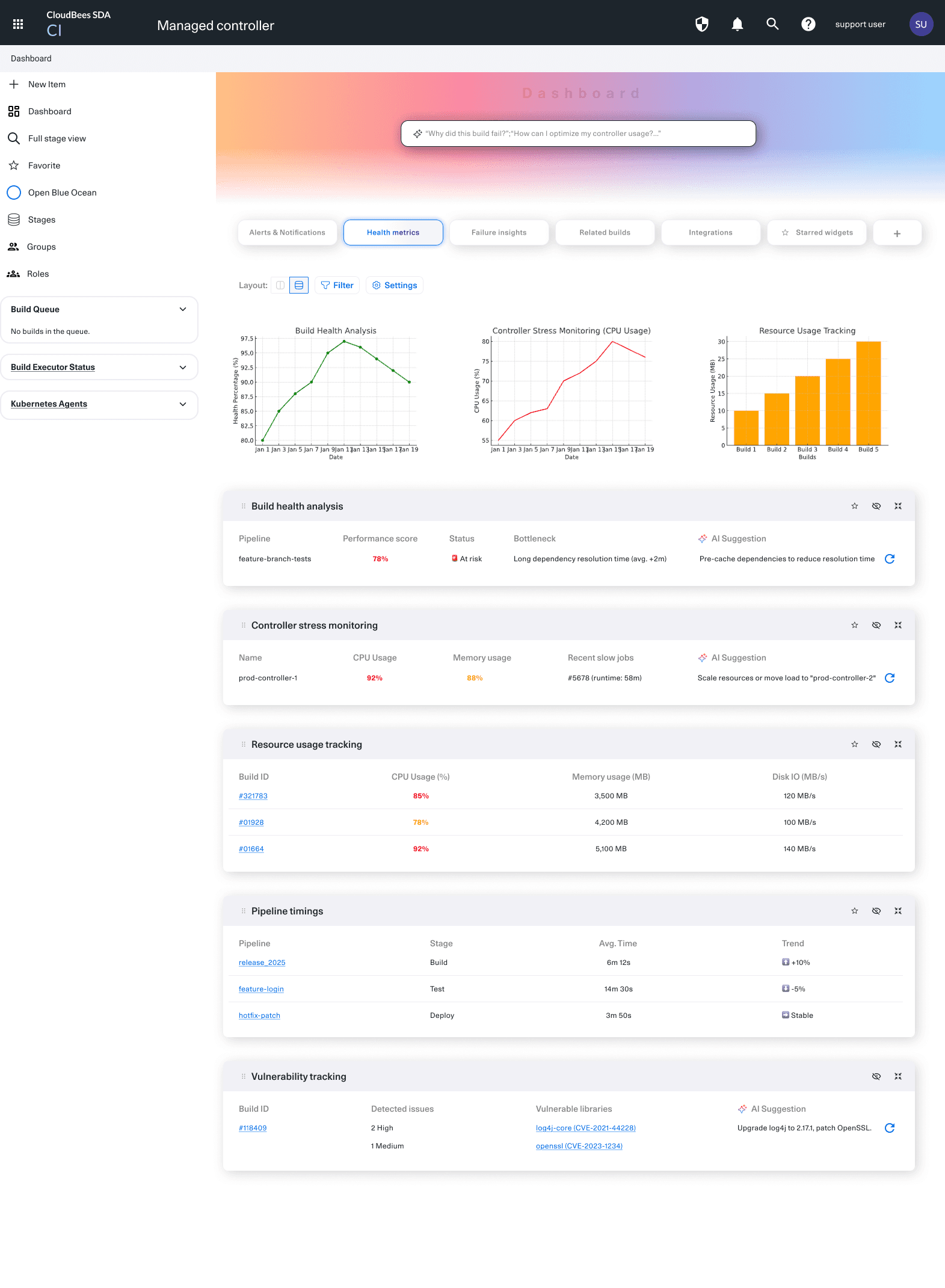
Modular Dashboard Widgets
Introduced drag-and-drop widgets that allow users to personalize their dashboard views and focus on the metrics that matter most.
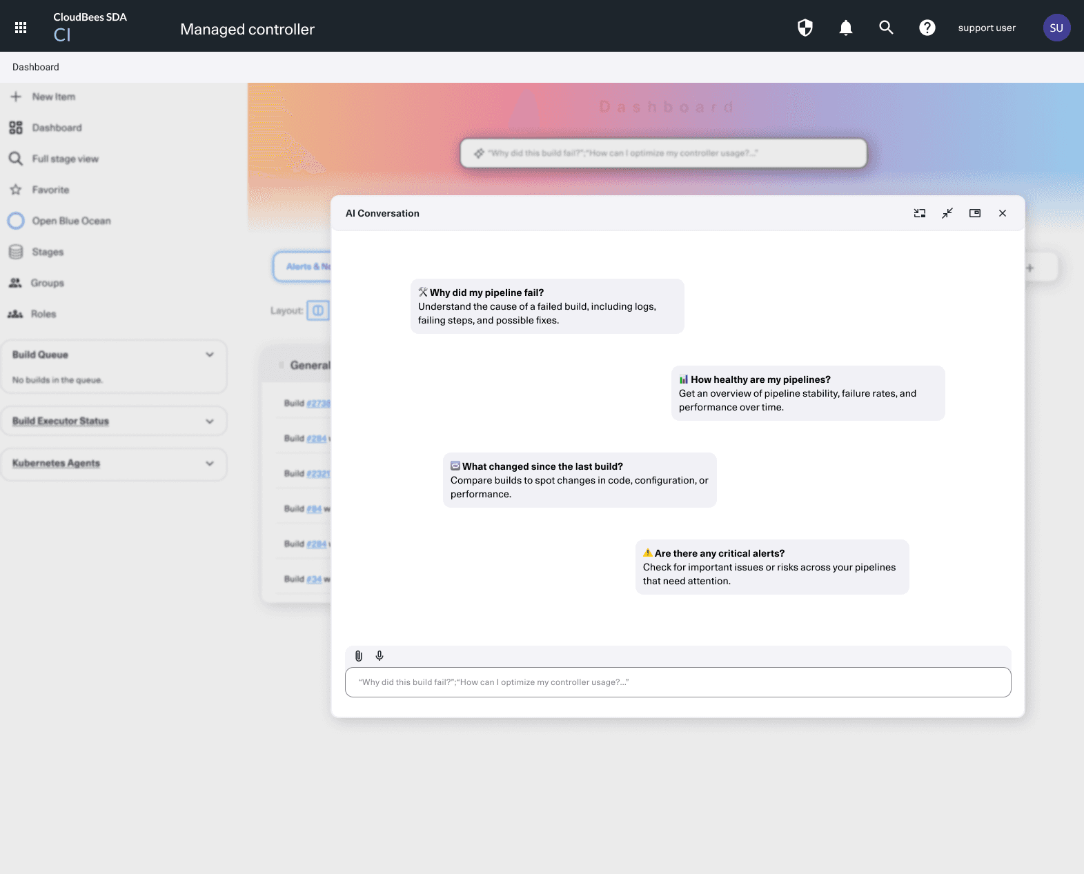
AI-Powered Troubleshooting
Developers can now ask natural language questions like “Where did my last pipeline fail?” directly in the UI, with AI generating contextual answers and links to related logs or events.
Visual CI Insights
Revamped charts and visual indicators highlight pipeline health, deployment risks, and trend anomalies in real time.


Here, the outcomes and achievements of the project are highlighted.
Faster Troubleshooting
The new design reduced time-to-diagnose pipeline failures by 35%, measured through log access durations and user interaction paths.
Higher Engagement
Dashboard engagement increased by 40%, based on usage analytics of widgets and AI assistant queries.
Improved Developer Experience
Post-launch surveys indicated a 25% improvement in perceived usability, with users highlighting the ease of navigating and interpreting complex CI data.