Public web · Information Architecture
Redesigning the CloudBees release notes experience for clarity and discoverability
COMPANY
Status
Built & published (Design initiative)
EXPERTISE
IA, DevTools, Public Web
YEAR
2026
TL;DR
CloudBees' public release notes site was functional but difficult to use, a dense, undifferentiated wall of information that made it hard for both developers and internal teams to find what they needed.
As a self-directed project during my final week at the company, I designed and built a working redesign concept using Claude Code, iterating through 100+ prompts to shape the final result.
The output was published to the design team's internal codebase: I pushed a PR to GitHub, had it reviewed and approved by a teammate, and merged it. This project wasn't assigned, it's a passion project that reflects both my design instincts and my growing ability to work hands-on with AI-assisted development tools.

This project reimagines the CloudBees public release notes website, redesigning the information architecture, visual hierarchy, and navigation to make release information genuinely useful for both developers and internal teams.
Built independently using Claude Code through 100+ iterative cycles, the result was published to the design team's internal codebase via a GitHub PR, reviewed by a teammate, and merged. It started as a gap I noticed and ended as a shipped artifact, a demonstration of both design thinking and AI-assisted execution.
Timeline
Designed and built in April 2026 during my final week at CloudBees as a self-initiated project. Published to the design team's internal codebase but not presented or discussed internally beyond the PR review.
Background
CloudBees maintains a public release notes website used by external developers and customers to track product changes, as well as by internal teams for reference.
Despite serving a critical function in the product lifecycle, the site had accumulated significant usability debt: the design was outdated, the information architecture made it hard to navigate across products and versions, and there was no meaningful way to search or filter entries.
For developers trying to understand what changed in a specific version, or whether a bug affecting their pipeline had been addressed, the experience created unnecessary friction.
Problem
Users, both external and internal, struggled with:
No way to filter or search by product, version, or type of change
A flat, undifferentiated layout with no visual hierarchy to guide scanning
Poor IA that grouped information in ways that didn't match how users think about releases
No clear landing page or entry point to orient first-time or returning visitors
This made a high-utility resource feel inaccessible, and reflected poorly on the overall CloudBees product experience.
Audit
I started by reviewing the existing release notes site end-to-end, documenting usability issues, IA gaps, and inconsistencies in how content was structured and presented.
Benchmark research
I looked at how other developer-focused products handle release notes and changelogs to identify patterns worth bringing into the redesign.
Design
Rather than stopping at Figma, I built the concept in code using Claude Code, working iteratively through 100+ prompt cycles to shape the layout, structure, and interactions.
This wasn't a one-shot generation; it was a design process conducted through AI, where each iteration refined the result closer to the intended experience. Working this way let me move fast while staying in control of the design decisions.
Shipping it
Once the design reached a state I was happy with, I pushed a pull request to the design team's internal GitHub repository. A teammate reviewed and approved it, and I merged and published it. It exists as a real, working artifact, not a prototype.
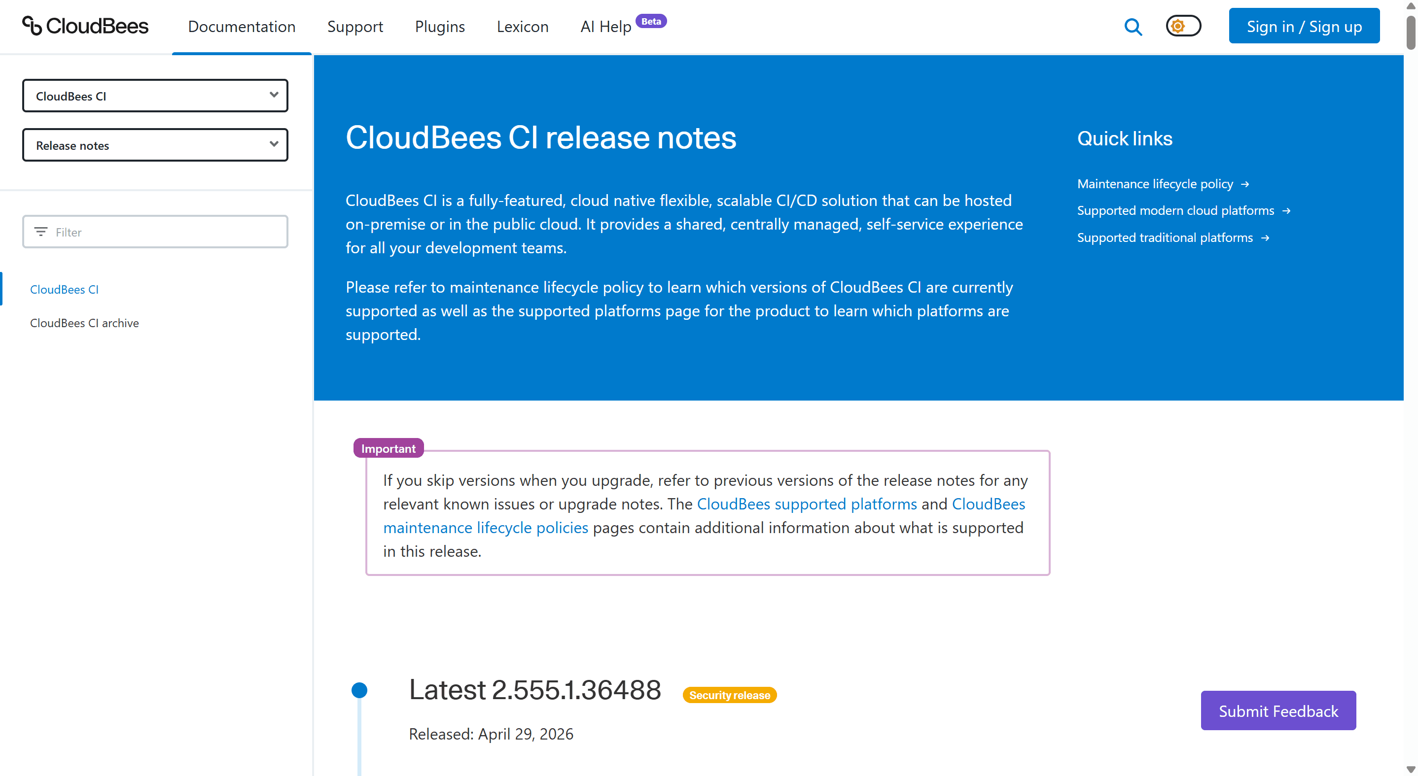
A clear entry point
A dedicated landing page that orients users immediately, showing what's new, what products have recent updates, and how to navigate the content.
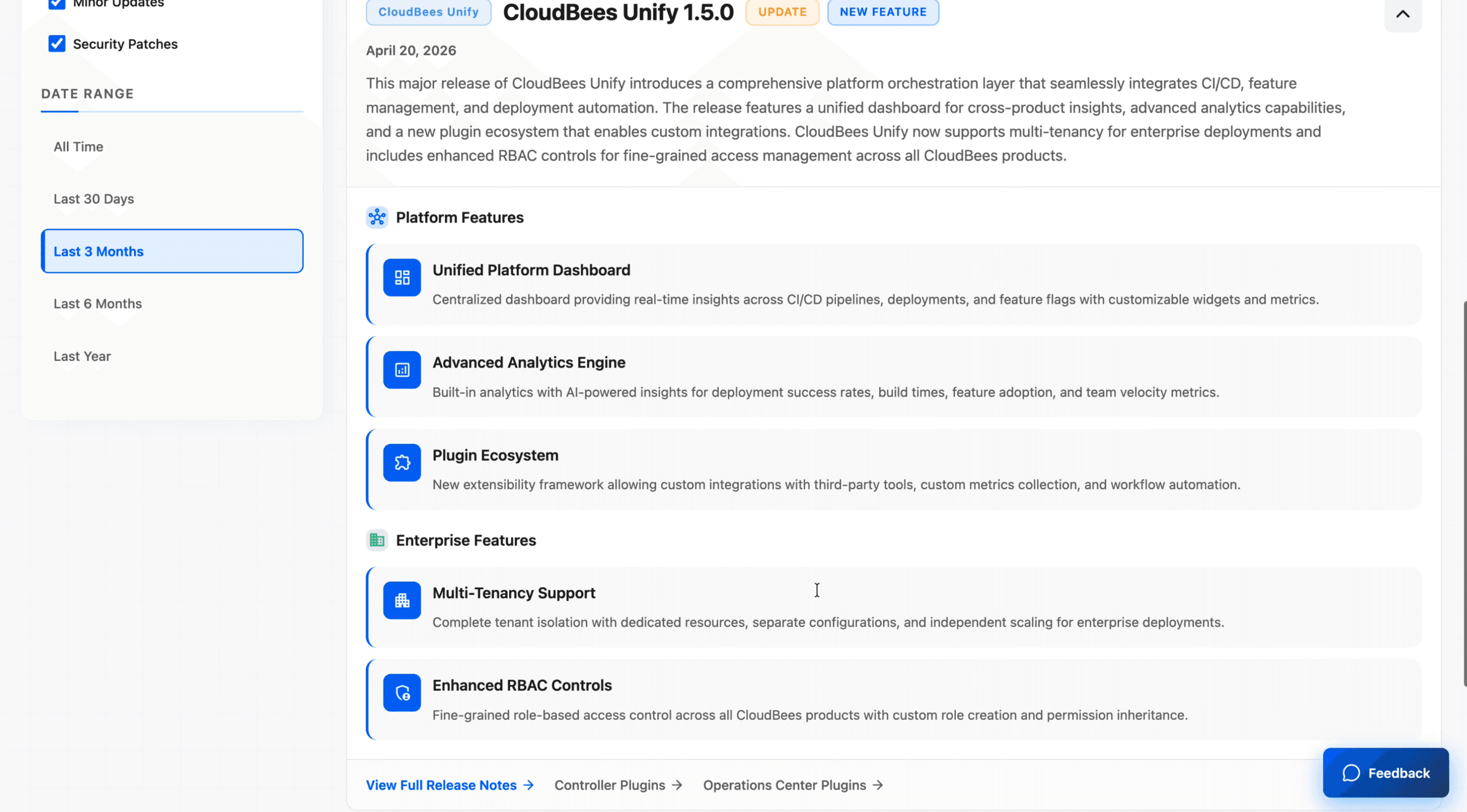
Structured categorisation
Release notes organised by product and component, so users don't have to scroll through unrelated entries to find what's relevant to them.
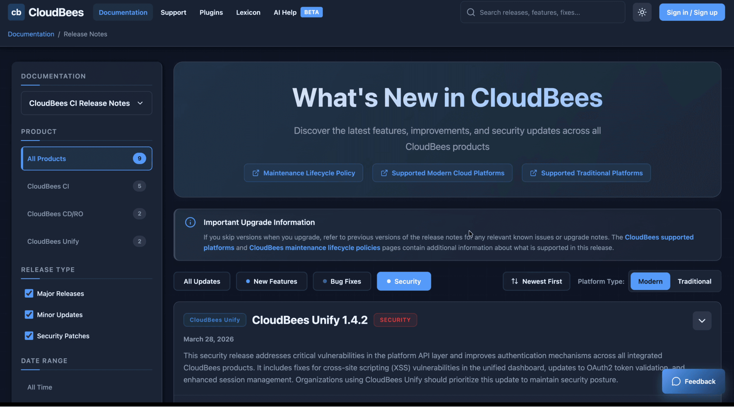
Search & filtering
The ability to filter by product, version, and release type, reducing time-to-information for developers referencing specific changes.
Improved visual hierarchy
A layout that uses typography, spacing, and structure to make entries scannable rather than requiring users to read everything linearly.

A shipped artifact, not just a concept
This project went further than a Figma file. It was built, reviewed, and published through a real engineering workflow, PR, code review, merge, deploy. That's a different kind of ownership.
AI as a design tool
Building with Claude Code over 100+ iterations showed me how AI-assisted development can extend what a designer can deliver independently, without waiting for engineering bandwidth. I used it not as a shortcut but as a collaborator: directing, refining, and making intentional decisions at every step.
Range beyond my assigned scope
I wasn't tasked with this. I spotted a gap, defined the problem, built the solution, and shipped it through the team's actual process. That's the kind of initiative I bring regardless of what's on my ticket.
What I'd do next
If this moved forward, the next step would be user testing with both internal teams and external developers to validate the IA and filtering model, followed by collaboration with content and engineering teams to integrate it with the existing CMS at scale.